How to Add Your Vaccine Passport to your iPhone

This article was written before the Government of Ontario improved how you could show proof of vaccination digitally. You can now add your certificate of vaccination to the Health App on your iPhone, in addition to other methods outlined here for Ontarian residents: Get a Vaccine Certificate.

Introduction

I’m straying from my usual ‘digital document how-to’ posts to write a Shortcuts app walkthrough post, inspired by BlogTO’s article: How to download your vaccine passport in Ontario. I’ve found the method they touched upon here to be quite useful!

Background

As of September 22, 2021, residents and visitors to Ontario need to show proof of vaccination to access many businesses and organizations. However, the Ford government has not yet launched an app or a card (like a Drivers License), leaving residents to come up with their own methods to show proof of vaccination. This could be low-tech like printing out your vaccine receipt and keeping it in your bag (you can print it for free at your local library if you don’t have a printer at home) – or making a shortcut on your phone! Below are detailed instructions on the latter.

Screen capture of the search bar in Gmail
Search for “COVaxON” or “Ministry of Health” in your inbox

Download your Receipt:

  1. Open your email on your phone or computer
  2. Search for “COVaxON” or “Ministry of Health”
  3. Download your receipt to a location you can access on your phone that connects to the Shortcuts app (ie: Photos, Pages, Dropbox, etc)
  4. Give it a meaningful name to make it easier to find it in future (ie: [my name]_Vaccine_Receipt.pdf)
Screen capture of the Shortcuts app icon on the iPhone
Open the default Shortcuts app on your phone

Make a Shortcut on your iPhone:

If this is too intimidating, other options are listed at the end of this blog post.

  1. On your iPhone, search for “Shortcuts” (this is a default app on your phone)
  2. Open the Shortcuts app
Screen shot of the All Shortcuts screen in the Shortcuts app
Click the plus sign
  1. Click the plus sign (+) in the top right corner
  2. Click “Add Action”
  3. Click “Apps”
Screen shot of the Shortcut app with the option to click Apps highlighted
Click Apps
  1. Select the app where your saved your receipt (in this demo, it is Adobe Creative Cloud)
  2. Select the vaccine receipt file
  3. Click “Next”
  1. Give the shortcut a short, meaningful name (ie: Vaccine Passport etc.)
  2. If you’d like, give it a unique icon by clicking the box next to the name and choosing a unique colour and/or icon from the available options. (I made mine red with a needle icon)
  3. Click “Done”
Screen capture of the Shortcuts app
  1. Now you will see your Shortcut on the Shortcut screen. Click the options button (ellipsis in a blue circle) on your new shortcut.
  2. Click “Add to Home Screen”
  3. Click “Done”
Screen capture of the Add to Home Screen button
  1. Close the Shortcut app by clicking the home button on your phone
  2. You will not see the new shortcut on your home screen!
  3. If you’d like to move its location, just hold your finger down on the app until all the apps jiggle, then drag it to its desires location on your home screen.

Now, whenever you need to show your receipt, just click your new shortcut!

If you use Siri, you can also tell your phone “Hey Siri, show my [shortcut name].”

Illustration of a group of people wearing masks
Cover vector created by rawpixel.com

Other Options:

If creating a Shortcut is too arduous and you don’t plan on using Siri etc, you can also do the following:

  • Treat it like a weblink: Save it to a secure server you trust (ie: Dropbox, Creative Cloud etc), open the URL on your phone (Safari is the default web browser on iPhone), hit the Share button, Add to Reading List, then “Save Automatically” to make available offline, then hit the Share button again and choose “Add to Home Screen”
  • Save it to your phone: then just search for it whenever you need to show it (Search bar > file name)
  • Print out your receipt: You can print it at your local library for free! Just remember to keep it with your keys so you don’t forget it when leaving the house…

For more information, please see the Government of Ontario’s webpage: COVID-19 in Ontario.

How to Painlessly Extract Images from a Word Document

There are two quick and easy ways to extract images from a Word document. This post goes through the steps to extract them on either your desktop or within InDesign.

In an ideal world, no one would supply a designer solely with images and charts embedded in a Word document. However, this happens regularly – often with the client not having access to the original media.

Screen shot of a Word document with an embedded photo. The photo is selected with a drop down menu with Save As Picture selected. A crying emoji is next to this dialogue box.

Before I came across InDesign Secret’s video and post, I would right click each image and select “Save As Picture”. This was a long and painful process, especially when you had a multitude of images to get through. Fortunately, there is a much faster way to do this!

In the Lynda.com video Extracting images from a Word document, David Blatner and Anne-Marie Concepción from InDesign Secrets share two methods:

Extract images from Word in InDesign:

  1. Place the Word doc
    (File > Place > select the Word doc > click your InDesign page to place it in the file)
  2. Open your Links panel in InDesign
  3. Select the images that were embedded in the Word doc
    (click on the first image, then shift-click on the last image)
  4. Go to the Links panel menu (top right corner) and select “un-embed link”
  5. A window will appear. Click “No”
    (you do not have the original images – if you did you wouldn’t be going through this process)
  6. A window will appear. Create a new folder to store your images
    (press New Folder > type in name > Create > Choose)

Extract images from Word on your desktop:

  1. Make a copy of the Word doc
    (right click the Word document > Duplicate)
  2. Rename the file type from .doc/docx to .zip
  3. A window will appear. Click “Use zip”
  4. Your file will now appear as a compressed file
  5. Double click the file to unzip it
  6. Navigate to the “word” folder within the unzipped folder
  7. Navigate to the “media” folder. There you will see all the images in the Word doc! Other items, such as Excel docs will appear in the “embedding” folder

Troubleshooting:

My folder did not unzip automatically. It turned out that the default program on my computer (Archive Utility) did not work for this task, but another application installed did (The Unarchiver). To get around this problem, I did the following:

  1. Right click your zipped folder
  2. Select “Open With” and select the alternative decompressor app on your computer.

Note, these instructions are for a Mac, but the process is similar on a PC.

WordsFlow Workflow

A Designer’s Love Letter to WordsFlow

I first learnt about WordsFlow when watching a tutorial on Lynda.com on Word and InDesign Integration. I have found that clients love the control they have over the text using WordsFlow, that they get to work in an application they’re comfortable with (I’ve yet to meet someone who uses InCopy), and how fast I can output an updated PDF for them. Before, they’d have to wait for me to make the text changes they need, but now I just need to press a button. Its great! 

And yes, you can place a Word doc in an InDesign file without a fancy plugin, but any formatting you do will be lost each time you update the file. WordsFlow allows you to keep all the formatting and layout you’ve done in InDesign, no matter how often the Word doc is updated!

Screenshot of a Word document

WordsFlow Workflow

My workflow is for the non-Pro version of WordsFlow that I have, but if you have WordsFlow Pro, you get a leg-up in convenience as it pushes the updates through. I do not have access to cloud storage or a shared drive at my workplace to collaborate with clients through – but if you do, you can eliminate the emailing back-and-forth I write of below.

Client Instructions

At each phase, we will be handling two files: one will be a Microsoft Word document in which you would make any text changes. The other will be a PDF where you’d make any comments on layout and visual presentation using PDF mark-up.

When text edits are made, please complete them within the Word document, then send the revised document back to me without changing the file name. I will then sync it on my end with my graphic design software and re-export the updated PDF document (after making any necessary adjustments to the visual presentation if things have shifted due to the text edits).

Please do not include instructions, comments, or notes in the synced document. Please use PDF mark-up for this instead.

By using this workflow, we eliminate the duplicate work associated with text changes, thus speeding up the editing process and reducing the chance of error. You have total control over the text content while editing text in a program that is familiar to you (Word). You get to focus on the content, and the designer focuses on how to best display that content, in a fast and efficient manner.

Best Practices for Word docs:

  • Use Word’s built it Styles for heading hierarchy (Heading 1, Heading 2). These styles will translate to InDesign, allowing me to maintain document structure and hierarchy.
  • Avoid using hard returns (the enter key) to create space between paragraphs. Instead, use ‘Space After
  • Do not use keystrokes to format text (tab key, enter key, excessive use of the space bar, glyphs for bullets). Instead use built in formatting tools like Page breaks, left indents, bulleted lists etc.
  • If your document includes tables, please make sure that “Repeat as header row at the top of each page” is checked on for each table (Table Properties > Row). Also, do not use heading styles (Heading 1, Heading 2) inside tables as this can create errors.
  • If you need to include placeholder text, I recommend pasting dummy text such as Lorem Ipsomin the Word doc.

For more information on creating Word docs that work well with the Word/InDesign plug-in, I suggest checking out ADOD and WebAIM. Added bonus – these best practices for the plugin are also best practices for accessible Word docs that can be read by people using assistive technology like screen readers, and also export well to other formats such as accessible PDF, ePub, and HTML etc. These are all round great habits to get into that save time lots of time in the long run!

Screenshot of a InDesign document with a Word document placed using WordsFlow

Designer Instructions

At the start of a project, I usually setup my client a template in Word using Styles I anticipate in my InDesign document. If a client has already sent me a Word file, I usually take some time to clean it up, (few people know how to use Word’s built-in formatting tools and Styles to their fullest). However, if you yourself aren’t strong in Word, you could totally work from a Word file where everything is set to the Normal Style (gasp!). However, I like to take this as an opportunity to show my clients how easy it is to create an accessible document in Word that transfers well over to InDesign.

I place the document using WordsFlow (making sure you haven’t pre-selected a text frame – then it wont work), then apply my Character and Paragraph Styles in InDesign. If I need to make any text changes, such as remove a forced break for example, I go to the Word document to make that change, then re-sync the document in my Links panel in InDesign. I want to make sure any changes I make to the text content is made in Word for continuity.

Once I’ve laid out the document with pictures and whatever else, I export a PDF and send it to my client with the Word document. They then make any changes to the text content in the Word document and send it back to me. I then replace the old Word doc with the new Word doc, re-sync, and presto – text is updated! There maybe some slight adjusting needed (Styles, breaks, pictures need shifting) but for the most part I’m ready to export in minutes! (Note: if you have shared servers or cloud storage with your client, you could probably store the file there too)

Screenshot of InDesign with the File menu open with WordsFlow, Place with WordsFlow highlighted

And no – I haven’t been put up to write this post by Em Software who owns WordsFlow. I just love this plugin so very, very much and think other designers would love it too.

If you want to know more about how WordsFlow works, I recommend Anne-Marie Concepción’s tutorial on Lynda.com such as Word and InDesign Integration. If your workplace or school doesn’t have a Lynda.com subscription, note that most public libraries, such as the Toronto Public Library, allow you to log into Lynda with your library card.


WordsFlow Troubleshooting: Document No Longer Linked

My favourite plugin in the whole wide world is WordsFlow. If you have text-edit-happy clients, this will save you the pain and suffering of changing a comma to a period and back again… repeatedly. Instead, they get to do all that themselves and you get to focus on what you do best – designing! Its honestly the best thing ever. No more duplicated work – I love efficiency!

If you’re not a WordsFlow user and curious how it works, I’ve written up a post on my WordsFlow Workflow. But now, the purpose of this post – troubleshooting!

The Problem

Screen shot of a linked text frame with WordsFlow icon with a red line over itNow, I had been working away on a 104 page guide book when all of a sudden I noticed my Word document was no longer linked to my InDesign file and there was a red line over the WordsFlow icon on each text frame. I consulted the WordsFlow User Guide, shut down my Word and InDesign programs and re-opened them. I restarted my computer too, but still the program persisted. The Word and InDesign’s file locations and names have not changed, nor has the version of software being used.

Of course, things like this happen when I’m working late at night. I took it as a sign to go home, shooting off an email to WordFlow’s Em Software Customer Support before I clocked out. When I returned the following morning, there was an email from Customer Support waiting for me! Here is what they wrote:

The Solution

  1. Make a backup copy of the InDesign doc, just in case. Update to the latest release of WordsFlow.
  2. Then, save the InDesign document as IDML, then open and save the IDML document as a new .indd document. This can clean up a lot of corruption.
  3. Then, un-link the link, using the command in the Links panel. Then:
  4. With the Type Tool in the story, Select All and cut the contents of the story. Paste it into a temporary frame on the pasteboard, or even into a new document for safe keeping.
  5. Use WordsFlow to Place the version of the Word document that was used for the previous update. This re-creates the link.
  6. Select All and paste the original story back, overwriting the just-placed document, to restore the InDesign document to the most recent state.

And guess what? It worked! I am a very happy customer.

Designing for Digital Accessibility: InDesign CS6 to PDF

Note: This article was originally written for InDesign CS6 users. As Adobe improves InDesign’s accessibility features and fixes software bugs, the workflow changes with it. Please see my Resources page for more up-to-date InDesign documentation.

Creating accessible digital documents can feel daunting, especially if you’ve never written HTML code before. Web developers and ePub designers definitely have a leg-up when it comes to creating accessible PDF documents – there are many similarities between the two. If you’re unfamiliar with how HTML works, I recommend WebAIM’s article on Semantic Structure for the web.

To help get you started, here is a suggested workflow for designing documents that are intended to be exported to PDF (or another electronic format like ePub) from Adobe InDesign. This article does not cover everything of course, but will get you going on the right foot.

Another good InDesign 101 is found through ADOD: Authoring Techniques for Accessible Office Documents: Adobe InDesign CS6

Step 1. Collaborate with Your Client

  1. Add the alternative (ALT) text to the metadata of each image file the client supplies
  • PC Users: Add ALT text to the Details of an image by right clicking the image on their computer, selecting Properties, and adding the ALT text to the Details.
  • Adobe Bridge: Add the ALT text to XMP: Headline
  • If they do not have time to do the above, ask them to supply the ALT text in a separate Word document or email for you to add yourself in Adobe Bridge or within InDesign through Object Export Options.
  1. Encourage the client to supply Word documents that use Styles and remind them not to use keyboard formatting (eg: tab key or enter to format text) or format using tables for layout or text boxes.
    • Bonus: This also eases importing text content and using plug-ins like WordsFlow.

Step 2. Before You Begin Your Layout

  1. Review the content and consider what Paragraph Styles you need to set up and what hierarchy is used in the headings of the document
    • It could be as simple as all headings being Heading 1, or Heading 1, Heading 2 etc. Note that headings cannot jump from Heading 1 to Heading 3 with no Heading 2 in between. Headings must be in a logical sequence. You can have many different Styles for a single heading.
    • Including a marker such as H1 or H2 in the Style name will help you remember what level of hierarchy they are.
  2. Consider using high contrast colour combinations for text and background to increase legibility. This also aids with photocopying/faxing etc. If your document is going online, it maybe required by law (ie: large organizations in Ontario), but its an all-round good thing to do.

Screen shot showing the File Info window and an InDesign document

Step 3. Beginning Your Layout in InDesign

  1. Add title and keywords to the document’s File Info (File > File Info)
  2. Use minimal text frames. I find that a single text frame is ideal for controlling reading order – use Styles and built-in formatting tools to arrange the layout of your text.
    • Note: You can format the text using built-in formatting tools such as columns (split/span), paragraph indenting, space before/after, baseline shift etc. Avoid using keystrokes to do your layout – it does not transfer well to assistive technology nor to responsive viewing or reflow.
  1. Open Structure (View > Structure)
  2. Add Untagged Items (menu at the top right of the Structure pane > Add Untagged Items)
  3. Create Paragraph Styles (or create as you go along)
  4. If creating Tables, designate a Header Row (place the type tool inside the first row (your Header) > Table > Convert Rows > To Header)
  • You should not have more than one header. If you have multiple headers, you may need to do a fair bit of tweaking in Acrobat.
  • Avoid using merged cells can disrupt reading order. Use alternative methods of layout if you can in this case. If you must use merged cells, advanced manual touch-up will be needed in Acrobat Pro.
  1. Set up automated Table of Contents (TOC) (Layout > Table of Contents)
  • In the TOC menu, make sure “Create PDF bookmarks” is checked under Options. Otherwise, your interactive bookmarks wont carry over to the PDF.
    • If you do not see this option, click “More Options”
  • Edit the hierarchy of the bookmarks (level 1, 2, 3 etc or all level 1) via More Options (note, you can control the look of your TOC by setting up specific Styles for the TOC text and spacing)
  • Update the TOC when changes to the document are made (Layout > Update TOC)

Screen shot of the Map Styles to Tags window in InDesign

Step 4. Finishing Up Your Design

  1. Map Styles to Tags (menu at the top right of the Structure pane > Map Styles to Tags)
    1. Select appropriate Tag for each Paragraph Style from the dropdown menu
      • Avoid using the H tag. This isn’t a widely recognized tag.
      • Anything not tagged will automatically be tagged as P (paragraph) – one less thing for you to do! 
    2. Tag footers/headers, page numbers, decorative images as Artifact (select the element > control Click > Tag Frame > Artifact)
    3. Add ALT text to image metadata in Bridge (if not done already) or using Object Export Options in InDesign (Object > Object Export Options > Custom)
    4. Delete any content from your pasteboard (this can carry over with the PDF and will be read by screen reading software). If you need to leave content there (eg: TOC), tag it as Artifact.

Screen shot of the Advanced Accessibility Options when exporting a PDF from InDesign. Display Document Title and English is shown

Step 6. Exporting Your Design to PDF

  1. Select PDF (Interactive) from the dropdown menu
  2. Confirm that “Create Tagged PDF” is selected
  3. You can also set things like PDF how you’d like the PDF to open up (ex: Fit Page) or carry over the Document Title to the PDF from your InDesign’s File Info

Screen shot of the Tools panel in Adobe Acrobat DC. Accessibility is highlighted under Protect and Standardize.

Step 7. Polish-Up Your PDF in Acrobat

  1. If in an older version of Acrobat Pro: Run Action Script (File > Action Wizard) if you have one set up for Accessibility (You can create your own, or use the default Accessibility script in Acrobat. I highly recommend making your own)
    If using Acrobat Pro DC: Run the Full Accessibility Check (Tools > Accessibility)
  2. Attend to any errors that maybe reported by the Full Accessibility Check of the Action Script (Pro tip: Google unknown errors for help)
  3. Tweak Reading Order (Tools > Accessibility > Touch-up Reading Order) if necessary.
    • Remember to drag down not up – and to save frequently.
  4. Instead of thinking of the document laterally or what your eye goes to first, consider what is the most important content (eg: the title could be 1st in the Reading Order, not a logo for example)

Note: If images are missing ALT tags, I encourage you to go back into InDesign and add the ALT text there – this will help out future designers updating your file, or you if you end up exporting the document again if there are additional changes.

General Tips

  • If colour is used to convey information, consider additional ways to convey that same information. For example, instead of wrong answers on a demo test being just in red, add the word “Incorrect:” at the beginning of the sentence. This will add a text cue to the colour cue that this answer is wrong.
  • Avoid using excessive ALL CAPS, bold, underline, and italic text as this can be distracting and inhibit the readability and legibility of a document.

Recommended Resources

Further information, instructional guides, and troubleshooting tips can be found online. Free resources from InDesign Secrets, Lynda Online Tutorials, Accessible Office Document Project (ADOD), WebAIM, Adobe Accessibility and Adobe forums are good places to start.

Everyone is a Designer

Speaking notes from talk in May 2017 on document accessibility #a11yto

As promised, here are my speaking notes from my 20 minute talk on document accessibility at the #a11yTO Meet-up on Wednesday, May 24th 2017 in Toronto:

Designing Accessible Documents

Introduction

Graphic design is everywhere – from the label on the beer bottle you’re holding, to the book you were reading on the way over here, to all the ads you saw along the way. Graphic design plays a big role in our lives – it’s about conveying a message to the widest possible audience. At its core, graphic design is about accessibility.

Agenda

We are here today to learn how easy it is to create attractive, accessible, digital documents. Now, I’ve only got about 20 minutes to talk to you today, so it’s going to be impossible to touch on everything you need to know. For those of you who are new to this sort of thing, I hope you will leave with practical skills and tools you can use right away in your personal and work life. And for those of you here today to which this is old hat, I hope I can entertain you.

Font

Font – typography – was my first love when it came to graphic design.  They express content through the visual representation of letters that form words through pattern recognition in our brains. Reading is a form of pattern recognition. The faster we can recognize the letters on a page, the more legible a font is. So although fonts can be a place of artistic expression, their main purpose is to be recognized as letters and read as words.

As an extra-young designer, I thought I could change the world with fonts – making a font that was both legible, and comfortably readable over an extended period of time. It was here that I discovered there was no definite answer to fonts – studies contradict one another, individuals have unique preferences, and there was no one size fits all for accessibility. But there are best practices:

Image showing different font weights

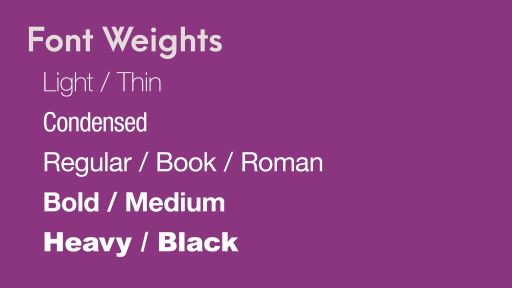
Characteristics of a Legible Font

  • Choose fonts that are medium in weight – avoid heavy, condensed or light fonts
  • Avoid script or decorative fonts – these are best kept to titles only
  • Choose common fonts – these are read more easily as the viewer is already familiar with the patterns they form on a page.
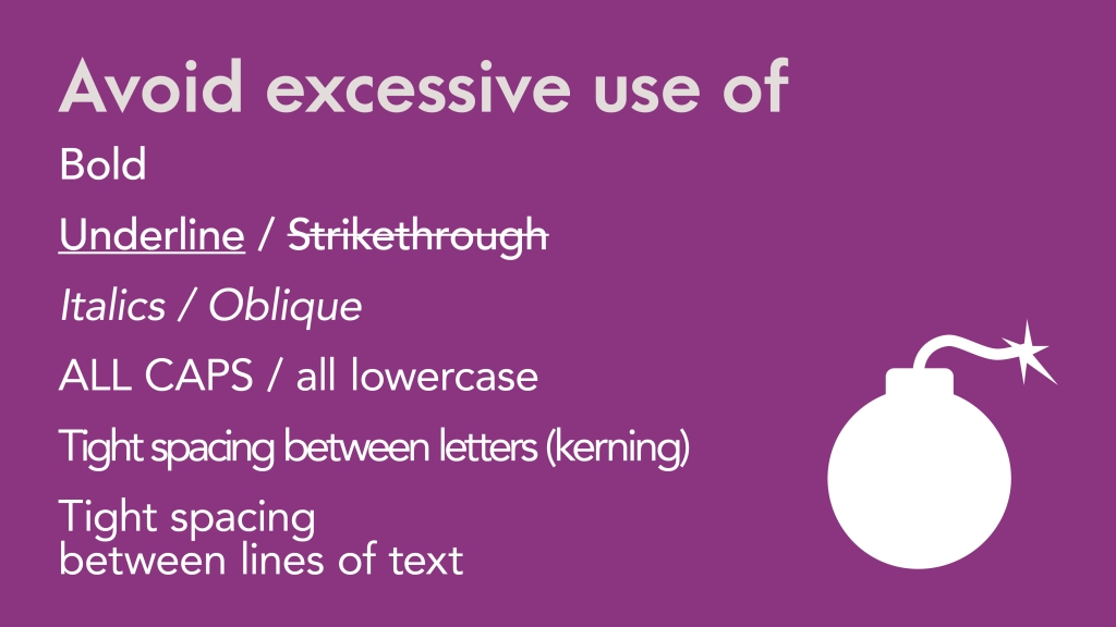
Image showing underline, italic, bold, and tight spacing of letters

Font treatment

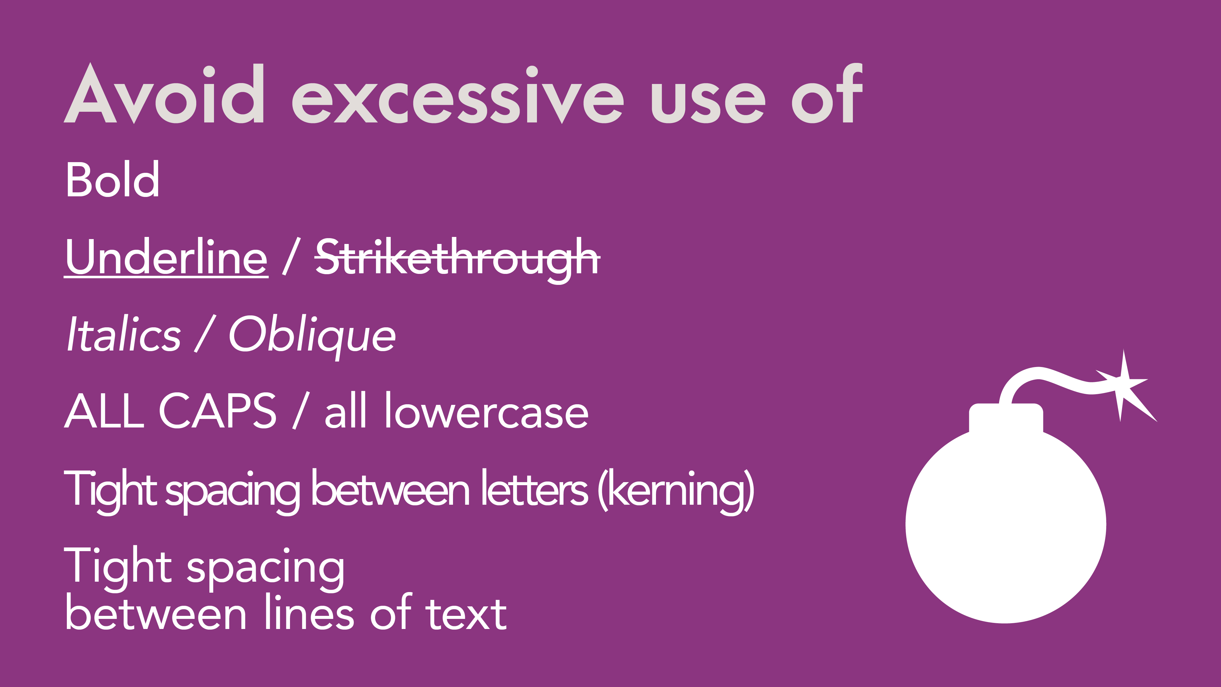
  • Avoid excessive use of bold, italics, underline, or ALL-CAPS – this disrupts pattern recognition and makes it harder to read
  • Avoid tight spacing between letters and lines of text (kerning, leading)
  • Generally aim for body text that is 10pt to 14pt in size on a standard letter sized piece of paper
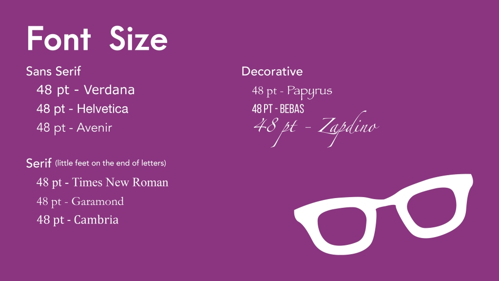
Image showing multiple fonts at thesame point size that look different in size

Font Size

Now I want to take a moment to talk about font size. When most people think of an accessible document, they think large type. However, font sizes are relative! 12pt in one may look like 22pt in another. And the beauty of digital documents, like PDFs or ePubs or HTML, is that it is scalable – the person can make it as big as they want. Giving a blanket statement like “All documents must be a minimum of 12pt.” is playing it safe. The intention is good but it doesn’t deal with design integrity or variables.

It is our responsibility as designers to speak to the widest possible audience. If making text 12pt for a project with small dimensions, such as an ad in a newspaper, is going to make everything squished and unreadable, we need to inform the client and take a different approach. There is no one-size fits all to accessibility – and that is why the Information and Communication Standard of the AODA is so open to interpretation, especially when it comes to print media.

Colour

When it comes to accessibility, font is often forefront in our minds – but what about colour and contrast? It’s often overlooked, but it’s one of the few things in the Web Content Accessibility Guidelines, WCAG, referenced in the AODA that can be applied to both web and print.

Image listing level AA and triple A WCAG requirements

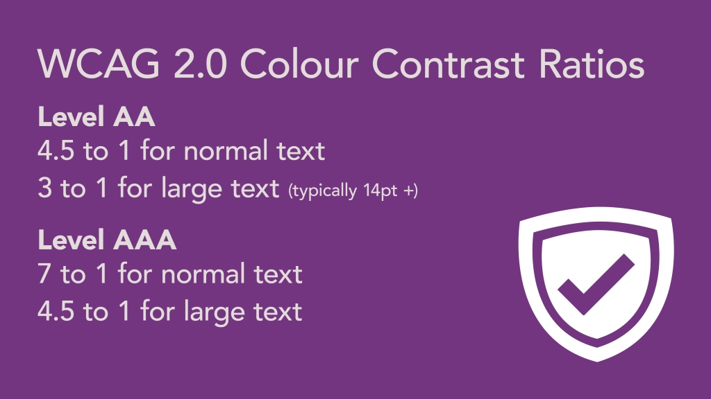
Contrast Contrast Ratios

WCAG is very specific when it comes to contrast ratios for colours used for text within a document. 4.5 to 1 is the minimum contrast ratio when it comes to finer text, like body copy, meaning it needs to be 4.5 times the intensity of the background colour. When it comes to larger text, like headlines and titles, we can dip down to 3 to 1 because these are relatively larger and more visible from a distance. These are minimums however, and aiming for 7 to 1 or above is ideal.

Contrast is important. The higher the contrast, the more likely the document can be read in different lighting environments and different screens. Remember that not everyone has a 4K retina screen or a quality mobile device. Designing to meet 7:1+ helps to ensure people with different abilities, technology access, and reading environments can read your document!

The AODA has specific dates for when different sized and types of organizations need to adhere to these contrast ratios in their websites and web content. You can check those out in the Information and Communication Standard.

Colour is more than just contrast – many people are colourblind too! So using just colour to denote meaning, like red to flag an error, is not inclusive – but using red, an asterisk, and the text (required) would help people know that an error has occurred – something you often see in online forms. The more ways you can express a message, the better.

As a designer working mostly on products for print that are posted online as a PDF with strict budgets, most of my text is on white paper. Ink is expensive after all. This can make it challenging to create bright and cheerful colour palettes, especially using colours like green, yellow, or orange as these colours tend to be quite close in luminosity to white. Blues, purple, and earthy tones are easier to work with on white backgrounds.

Colour Demo

One of my favourite tools to asses colour is Paciello’s Colour Contrast Analyzer. It’s a free desktop app for PC and Mac. Simply click on the colour picker, then select your foreground colour, click on the eyedropper again and select the background colour surrounding your text. I love how easy this is to use and how you can assess literally anything on your screen. It can be a lot of fun!

If a colour contrast fails and you’re unsure what to try, just copy the hex code from the Analyzer and paste it in Tanaguru Contrast-Finder – this web app will suggest similar colours that pass. I love this app!

Image text showing heading levels in a document: heading 1, heading 2

Hierarchy

Being able to look at a page and figure out quickly what is the message and the order in which its suppose to be read is incredible valuable! Fortunately, this is worked into the core principals of design through the use of negative space, proximity, and scale.

Negative space is the white space on a page. You want there to be ample negative space between elements to give the eye a place to rest. Proximity helps to show what content is related and the order of which to read. Scale helps to show importance, like the size of headings on a page.

Machine Reading

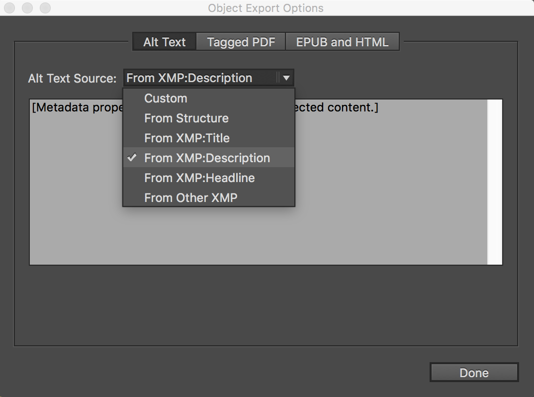
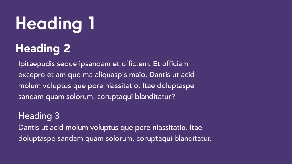
You can use negative space and type treatment to control the eye in visual representation of info, but how can you do that for machine-reading? For your eReader or screen-reader for example? You do that with tagged headings!

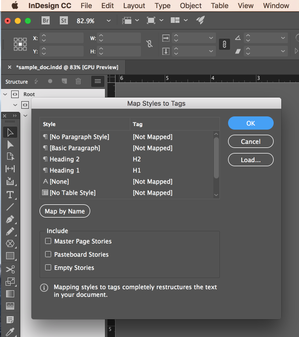
Now you don’t need to be a coder to do this sort of thing. All you need to know is how many headings you have and their relation to one another. So, heading 1 would be the first heading on the page. If Heading 1 has a subheading, then that would be Heading 2.

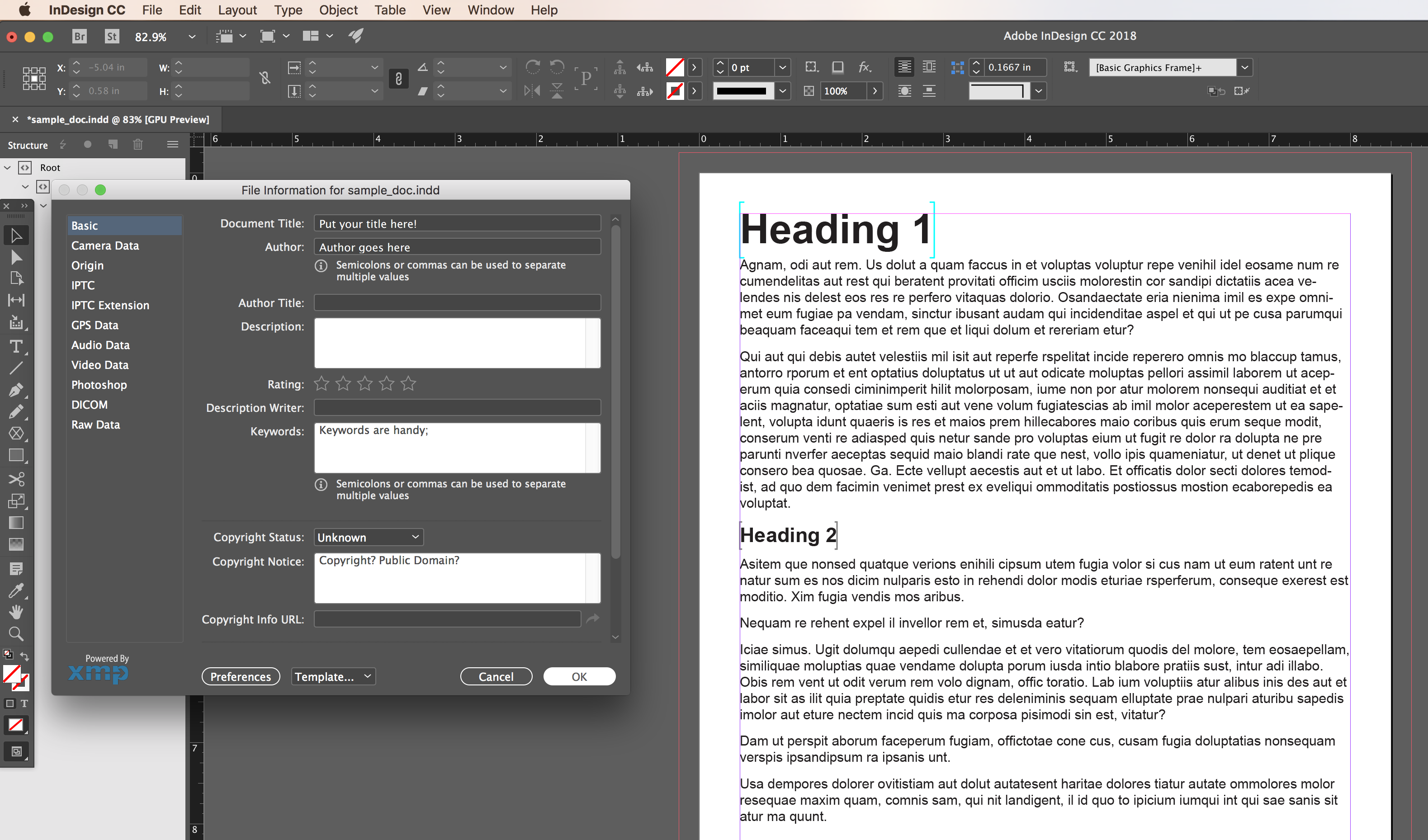
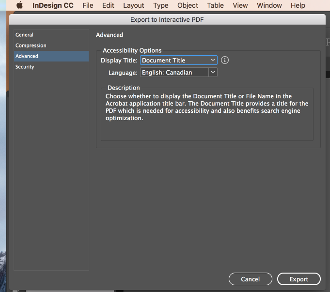
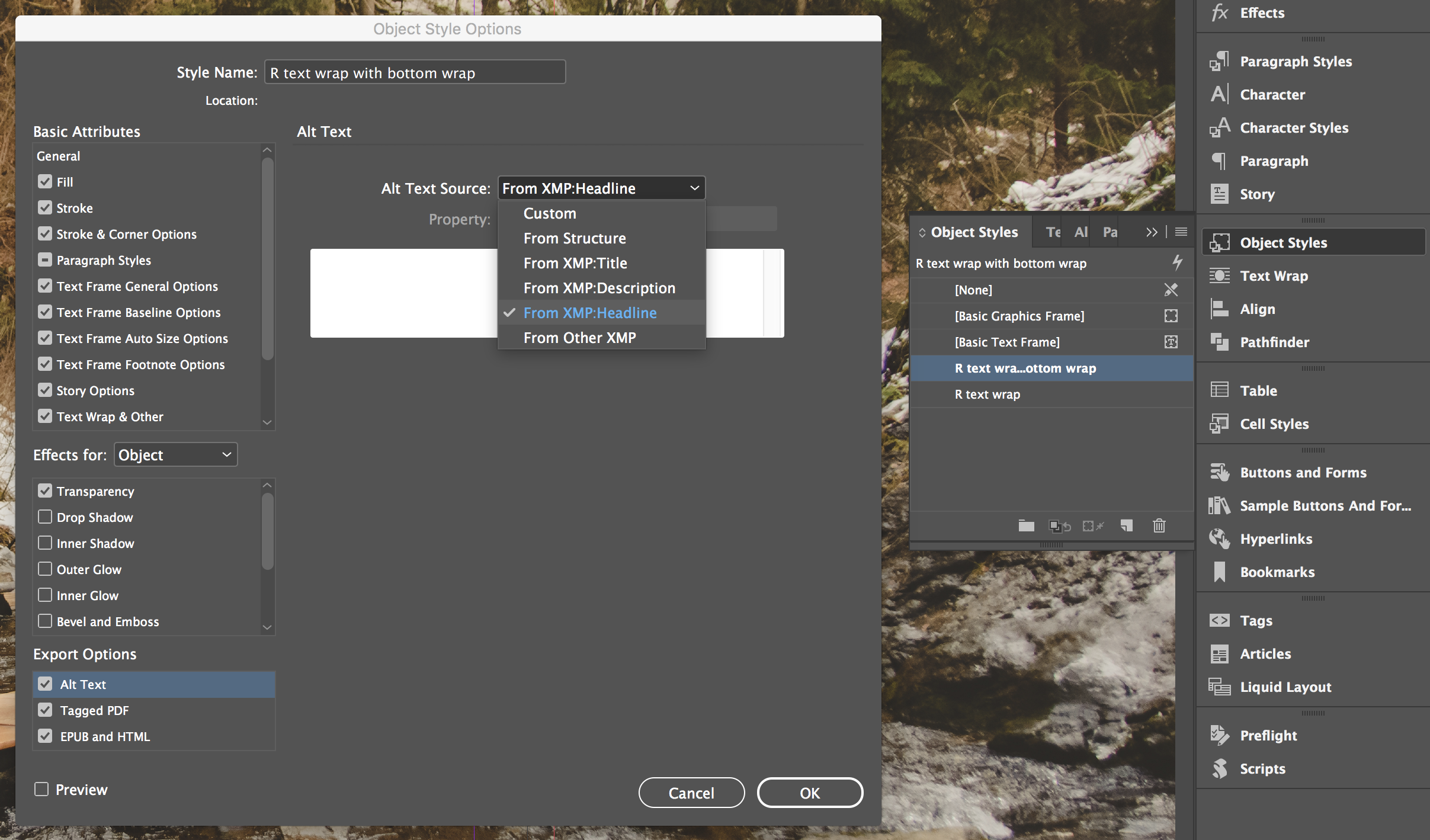
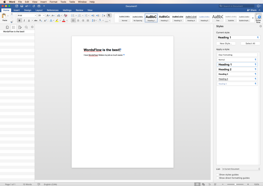
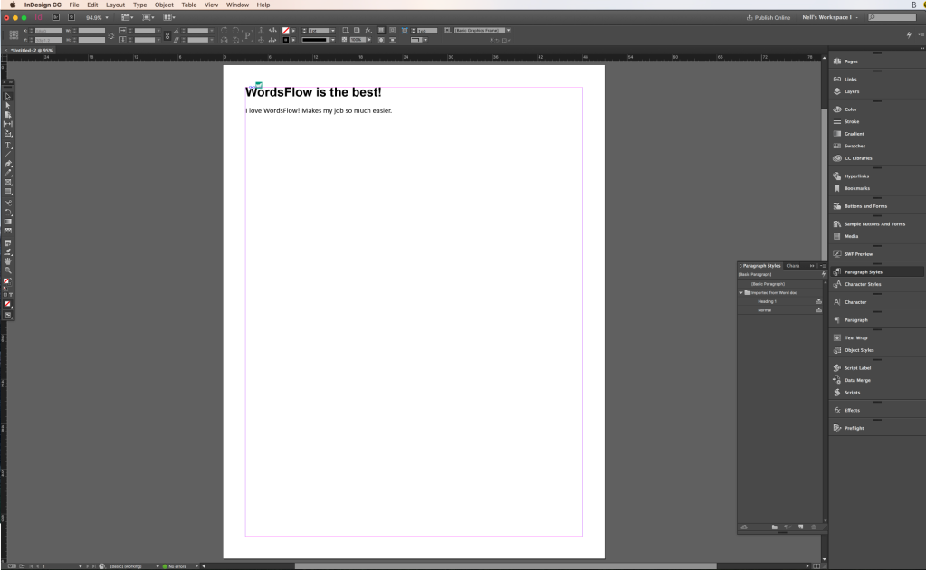
You can find these headings in Word under Styles, which you can customize to look just like you want! If you’re using graphic design software like InDesign, you would map the tags to the Paragraph Styles you created for your document. The default for both is paragraph – the P tag. If you were to export a PDF without using Styles, everything will default to paragraph text. You don’t want that – unless your document has no headings of course.

There are also great curb cuts to using Styles too, like automatically generated table of contents or linking references within a document. Tagged headings are an all-round great thing to use! It also enables you to change the look of all your headings at once. If your client comes to you and decides they want all the headings in Verdana instead of Gotham (font), you just have to edit the style once instead of going through the document page by page.

Other Tips

Outside of tagging, there are other things you can do to control the way content is read by a computer.

  • Word: Avoid using text boxes – they can be read in unintentional places, even if anchored
  • InDesign: Avoid using multiple text frames – they will increase the chances of reading order going rogue when you export to PDF.
  • Both: Don’t use keystrokes to format your content (tab and enter) – it doesn’t reflow or read aloud properly, and the keystrokes maybe read aloud too
  • Both: Don’t use tables to format your content – if it doesn’t have a header row, then it is not a table.

Instead, use the built in formatting tools to layout your content:

  • Word: columns, breaks, space before and after, lists
  • InDesign: split/span, space before/after/offset, lists

And a handy tip – if you want to see how your document is structured, turn on hidden characters. This will show you what keystrokes and breaks are used. And if you’re using PowerPoint or Word, turn on the Navigation Pane to make sure your content is there.

I’m not going to go into testing/remedification in the time we have remaining, but NVDA is a great free screen-reader you can test your documents with – and just tabbing through your document with a keyboard only is a good way to test out your document in addition to using automated accessibility tools like those found in Word, Adobe Acrobat, and PAC.

Resources

So that’s it! If you want more in-depth information on document accessibility, I recommend Karen McCall/Karlen Communication’s conference handouts and Access Ability by the Registered Graphic Designers, RGD. If you’re fresh to this, Accessibility of Office Documents and Office Applications, ADOD, and WebAIM are great places to start (and refer back to). There’s lots of other great resources out there too – these are just some of my favourites.

Feel welcome to check out the Resources page on my blog for more guides, reports, and tools.
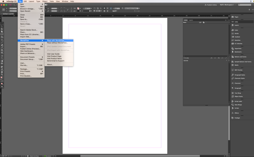
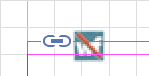
How to Markup a PDF

Why should I mark-up a PDF?

Using comments and annotations to digitally mark-up a PDF help to reduce miscommunication, typos, errors between you and your graphic designer. It increases clarity, and helps to speed up the revision process. It’s a win-win for both you and your designer!

When you mark-up a PDF, the designer gets an automatically generated checklist of your requested changes to help them keep track of what they need to do and what tasks they’ve completed as they go along. When paired with clear communication, a designer can easily understand what needs to be done, changes to be made or content deleted, and areas to approach differently – all in one place!

It is fast, efficient, and clear.

How do I add annotations and comments to a PDF?

Setting-up Your Workspace

Most computers have an PDF reader on them. Acrobat Reader is the most widely used one out there. You may already have it on your system without even knowing it! If you don’t see Adobe Reader in your Applications folder, you can download it for free online:

Download Adobe Reader DC 

Screenshot of the View dropdown menu in Acrobat XI

Older versions of Adobe Acrobat Reader:

  1. Open the PDF in Adobe Reader
  2. In the upper toolbar, click View.
  3. From the drop down menu, select Comment > Annotations
  4. A selection of Annotation tools will appear to the right of your screen.

Adobe Acrobat Reader DC:

  1. Open the PDF in Adobe DC
  2. In the upper toolbar on the far left, click “Tools”
  3. Scroll down to “Review & Approve”
  4. Click “Comments”
  5. A selection of annotation tools will appear in the upper section of your screen.

Screenshot of the tools in Adobe Acrobat Reader DC

Getting Started with PDF Mark-up

There are many ways to approach the feedback process with PDF mark-up. To help get you started, here are some tips on when and how to use the annotation and comment tools in Reader:

General Feedback

Yellow speech bubble Comment bubbles are for providing feedback and instruction to the designer.

If multiple people are commenting on a document, please delete any unnecessary comments (such as internal conversations or unanswered questions) and leave only what is relevant to the designer. This will prevent any confusion and help the revision process go more efficiently.

Drawing and markup tools in Acrobat XI

Use shapes to draw attention to certain areas of a document. This is a rarely used tool in my experience – but its good to know its there for the odd occasion you need it.

Text Changes

Text icon with a red strikethrough The red strike through is used for deleting text.

Text icon with blue strikethrough and blue arrow next to it The blue strike through is for replacing text.

Text icon with blue arrow next to it The insert text tool for adding new text.

Highlighter icon in Acrobat XI The highlighter tool draws attention to a certain area of text.

If providing new text, avoid the temptation to write “Please replace with…” or to make conversation with the designer within your annotations. Instead, just add the new text. That way the designer can just Select All and paste in the document. This saves you both time!

Changes to Visual Elements

Paperclip icon You can add files, such as images, with the paper-clip icon.

When sending an image to be used in the design, graphic designers usually prefer images be sent separately so that  we can import them directly into our working project folder.

Additional Notes:

Repeated Consistent Changes:

If you are giving direction that applies to the whole document, you only need to say it once, not each time you come across it in the document. Examples of this would be “Align all text to the left in this document” or “Remove all full-page images/blank pages in this document” (note the word all here). This will save you from typing it out numerous times and cluttering up the PDF with redundant text.

Need More Information on Marking-up PDFs?

If you need more guidance, there are lots of video tutorials, written instruction, and posts on PDF mark-up online. Just google your query, or check out these links: Reader XI (older version that these instructions were initially written for) and Reader DC (newest release of Reader).

Screenshot of a marked-up PDF
Sample of a marked up PDF as viewed in Acrobat Pro DC.

PDF Mark-up Pet Peeves

Padding Statements

If you want your graphic designer to do something, just tell them to do it! Do not pad it with wishy washy language like “Maybe you could try…” or  “What do you think if…” or “… but you’re the designer.” unless you actually do want to know what your designer’s professional thoughts on the subject before they complete the task.

PDF annotation is not the place for discussion. It is for direction. If you actually do want to discuss a design idea with your designer, do it over email or phone or someplace else.

Respect your designer’s time and save yourself the extra typing. Just type what is needed in clear, concise language. Nothing more in the PDF.

Identifying the Rejects

Do not mark the rejects during concept development. Instead, only mark the pages you like/have changes to/want elements from. Marking a concept “Don’t like this.” or “Not this one” is redundant. You’re giving yourself extra work, cluttering up the document’s annotation checklist, and taking the focus away from what needs to be done in the document.

However, if there is something about a rejected concept you want the designer to know about, that is different. For example, “We don’t like this concept because its too dark. Please try this layout with brighter colours” is providing valuable feedback and direction. You are identifying why you don’t like the concept and directing the designer to approach it in another specific way.

Writing a Novel in Comment Bubbles

I have had over a page of text in a single comment bubble… which I was able to summarize down to fit on a single post-it note on my desk. Again, save yourself time and the designer’s time by being clear and concise in your instruction. Save your novel writing for after-hours.


Degrees/Certifications in Digital Accessible and Inclusive Design

Where do you go for a post-secondary education in digital accessible and inclusive design? All of the locations above are currently in my home base of Toronto, but I’d like to add programs from all around the world! Know of one I missed? Let me know! Here is the list I’ve complied to date:

University

Master of Design, Inclusive Design (OCAD University)

College

[none known – but let me know if you know of one and I can add it to the list!]

Free!

Free MOOCs offered by Ryerson University:

Discontinued Certification & Degrees:

Certificate in Accessibility Practices: AODA and Beyond (Ryerson University, Chang School of Continuing Education) Previously known as Certificate in Advancing the AODA.

Inclusive Design in Digital Media Certification (Humber College, Continuing Education): $96.00 per course (4 courses for Certification of completion – 24 hours in the classroom total)

How to add ALT text to image metadata

These instructions are written for InDesign users and people working with graphic designers, but could be applied to other applications and fields as well.

Although images cannot carry actual alternative (ALT) text around with them, you can add the ALT text to the metadata of an image to use as you please. This aids in efficiency and reduces chance of error when applying ALT text to images.

This post covers two methods for collaborating with your client/communications on applying image metadata:

  • Adding ALT text to image metadata on their PC (no special software required – free!)
  • Adding ALT text to image metadata using Adobe Bridge (subscription required)

Alternatively, the designer can do the above if the client is unable to.

Followed by three different methods for graphic designers listed below:

  • Applying the image metadata as ALT text manually in InDesign via Object Export Options
  • Applying the image metadata as ALT text in InDesign using a Script (my personal favourite)
  • Applying the image metadata as ALT text in InDesign using Object Styles

Screenshot of image properties, details tab open

Client:

Adding ALT text to the metadata (PC/Windows):

  1. Select your images and write out your alternative (ALT) text.
  1. Open the folder where your images are kept (ex: Pictures folder in Windows)
  2. Right click the image
  3. Select “Properties” from the drop-down menu.
  4. Click the “Details” tab.
  5. Paste your ALT text into the “Title” input field of the photo
  6. Click OK (this will save the metadata)
  7. Send the photos with the metadata to your Designer/Design Request. Inform your designer that you have put the ALT text in the Title/Description field of the photo’s metadata.

Note: Instructions above written for Windows 7 users.

Faster Alternative: Adobe Bridge

If your client has an Adobe Creative Suite license, they can do these steps faster in Adobe Bridge, where they would put the ALT text in the Description OR Headline field of the image metadata.

Screenshot of the script panel in InDesign and ALT text script dialogue box

Designer:

Below are instructions on 3 different methods to apply image metadata to your images as ALT Text within InDesign: using a script, doing in manually, or using Object Styles. Choose the one that works best for you:

Applying ALT text with a script

  1. Confirm you are using the photos with the metadata (can double check by opening in Adobe Bridge – text will likely be in the Description field)
  2. Run the ApplyALTfromXMP script
  3. Confirm the ALT Text Source is “XMP: Description” (or wherever else the ALT text is saved)
  4. Click OK
  5. If successful, you will get a dialogue box with total number of images processed displayed. Click OK.
  • If you do not get the quantity you were expecting, confirm the location of the ALT text in the metadata.
  • If you do not get a dialogue box, something is wrong with the script and you’ll need to troubleshoot.

ALT Text Script:

If you do not have the ALT text script installed, you will need to install it yourself. Instructions and free download are at Batch Apply XMP ALT Tags to EPUB and HTML Images

Screenshot of the object export options window in InDesign

Applying ALT text manually

  1. Confirm you are using the photos with the metadata (can double check by opening in Bridge – text will likely be in the Description field)
  2. In Design, select the photo
  3. Go to Object in your top navigation bar
  4. Select Object Export Options from the dropdown menu
  5. Confirm you are in the ALT text input area
  6. Click “Text Source”
  7. Select “Description” from the dropdown menu
  8. Click “Done”

Note:

Skip Step 3 and 4 by using the Option Export Options key command Opt+X (if not default on your system, you can set up a custom key command to speed things up)

Screenshot of the Object Style Options window in InDesign

Using Object Styles for ALT Text

If you are using Object Styles in your document (great for long docs!), you can also automate the ALT text there.

  1. Create an Object Style.
  2. In the Object Style’s export options, you will see ALT Text, Tagged PDF, and ePub. Select desired option.
  3. From the dropdown menu, select  “From XMP: Headline” (or wherever you’ve stored your ALT text)
  4. Click OK to apply the changes.

Now, if you check the Object Export Options of your image that style is applied to, the ALT text should be there!

Guelph Conference: Day Two

My conference notes from Day Two of the Accessibility Conference at UofG. My notes from Day One are also available: Accessibility Conference: Day One #accessconf16

When Good Intentions Go Wrong with Brian Kon, Sterling Frazer Associated

  • People with disabilities (PwD) is the largest minority group in the world – the only minority group you can join at any time!
  • Signs behind glass windows are a problem when it comes to glare
  • Be consistent
  • Trail signage at start of trail: length of trail, terrain of trail
  • Choosing green for a nature sign is not smart – disappear in foliage

Build Environment:

Beyond checklists with Janna Cameron, D2L

  • Usability testing: calmer to have someone going through your system with AT instead of an angry customer who’s been passed from support person to support person at your company
  • Mentors help keep motivation going after the initial excitement about accessibility; to push and encourage as you make progress
  • Mentors need a broad understanding; keeps knowledge current; understands AT and browsers

Bundy’s Hierarchy of Digital Needs

  • importance of describing PowerPoint content for people who cannot see them (story of colleague sending texts to describe slides during another’s presentation)
  • Bundy’s Hierarchy (base to tip): Not accessible, not usable > accessible not usable > accessible and somewhat usable > Accessible, usable digital bliss
  • No skip links: have to read the main navigation all the time
  • Flash can be made accessible, but not great
  • CFL.ca has a blissful website: logical headings, empty ALT for dec. mages, easy contact form
  • CBC.ca has a blissful website – one of the best I’ve seen in my life: clear links; headings, labelled forms
    • Improvement: table headers on row and columns; don’t repeat the same links

Bundy’s Accessibility Enhancements

  • headings: organize page content and page sections
  • Screen reader’s can miss images as buttons
  • Signify whether pages open in a new window with an image with ALT or use ARIA
  • ARIA is a temporary solution that fills in gaps; very useful – but don’t put ARIA on everything
  • Forms: Not all AT recognizes placeholder text

David Onley: Capstone

  • challenges create broader choices and enhancements
  • accessibility allows people to achieve their full potential
  • inclusion is part values, attitude, skill and funding
  • values and attitudes are the more challenging to change
  • attitudinal barriers are the biggest barrier to overcome
  • 3.8 million PwD in Canada are unemployed
  • Employers fear hiring PwD
  • Instead of able-ism, I think disable-phobia is a better term
  • Unjustified terror paralyzes efforts to convert unemployment into jobs
  • compare plight of PwD employment to women rights, racism
  • We are us, we are not them; there is no them or they
  • PwD cross all minority groups (aboriginal, LGBTQ2S etc)

Implementing WCAG & Beyond: Lessons Learned from User Feedback with Jason Soo Hoo

  • partnership with Kitchener-Waterloo AccessAbility
  • We don’t guide them through, but observe how they approach the task
  • Lessons learned: skip to content;
  • Skip to content: names anchor and CSS
  • Semantic HTML: a button is a button, not a div
  • Pop-up tabs: reasonable solution with lists and ARIA
  • ARIA roles and alerts: forms

Workplace Inclusion with the RBC Accessibility IT team

  • Talk focus: employee accommodation from a digital inclusion perspective
  • All projects at RBC go through various gates, one of which is accessibility
  • IT Accessibility in Technology & Operations collaborated across RBC and with vendors in areas such as creating RBC IT Accessibility Requirements/Guidelines; training on providing accessibility testing; consulting on technology procurement; admins IT Accessibility Project Certification process; chair JAWS and Zoom Text user group across the country so employees aren’t so isolated, meeting once a quarter;
  • when consulting, we follow the W3C’s best practices
    primary method that people meet us: all technology projects need to go through our team for review
  • provide recommendations to procurement
  • keep up to date on new technologies
  • 4 consultants take turn monitoring the IT Accessibility Mailbox; the monitor will take on the projects from start to finish that come in during that time
  • important to have guidelines as a consistent point of reference; why we do it; code snippets how you do it right and wrong
  • emphasis on manual testing; everyone on teams have JAWS and ZoomText
  • Self-serve models with us available to consult and advise

Training at RBC for Accessibility

  • RBC Campus is our learning management system
  • mandatory course for business systems, analysts, and developers on accessibility (four core principals according to WCAG); course available to all RBC employees
  • Individual project training

Procurement

  • Get vendors to commit to an accessibility road map to create a solution for us
  • We have a list of questions so when we work with procurement for initial assessment based on WCAG and open ended questions
  • Describe your testing process? (don’t ask accessibility specifically)
  • What’s your in-house expertise in accessibility?
  • “A little knowledge is dangerous.” – a vendor may use ARIA to fix everything, but keyboard accessibility can’t be fixed that way
  • A lot of people say they know about accessibility, but they don’t
  • Get a clause on accessibility before you get your contract signed with a vendor (otherwise they’re use accessibility to up the price)
  • We don’t score vendors, we rank them: pros and cons of each
  • answers help RBC to work on contract that is informed by the results; where the vendor needs to improve

Ad Hoc

  • Video CC and AD in house
  • Consultation; How to; best practices
  • Accessibility Clinics

Audience Discussion

  • RBC openly shares common challenges with other banks
  • We all have common challenges on Windows with JAWs, Dragon, etc
  • Vendors can make us feel like we’re the only ones asking for accessibility, but other banks are asking for the same thing
  • JAWs and ZoomText are most commonly used by RBC employees
  • The team does not deal with AT, ergonomic keyboards, screens etc – focus on the more complicated things that involve scripting and special tools/navigation
  • RBC has a Workplace Accommodation Group and other partners across the enterprise
  • Make it more clear what accessibility is to your organization
  • When we ask for a vendor road map, we ask how they plan to do it to see if its feasible; recommend third-party firms they can engage
  • We all have a harmonized approach to accessibility internationally for guidelines and best practices; challenge to find people below WCAG 2.0 AA;
  • Lester has on average 50 projects at a time, but not are active all at the same time
  • Our self serve model: give guidelines to project managers to distribute to developers; know who’s on the team and how much guidance is needed from that particular project
  • Very verse projects: mobile, ATM, web etc
  • co-op students lead Accessibility Clinics; always looking for co-op students with disabilities
  • processes are advanced – been doing accessibility for ten years
  • Richard Aubrey encourages anyone in the audience to email him questions

Speakers: feel free to contact me if I misinterpreted something you said or if you’d rather your talk was not posted online.